2018 – 2019
Chippewa Ranch Camp
New logo, brand identity, website redesign & brochure for a girls’ summer camp in northern Wisconsin.
Refocus on Story
Chippewa Ranch Camp is a traditional, overnight summer camp for girls in Eagle River, Wisconsin. I first worked with them in 2012 when they approached Ronningen Design for a new website. During the early 2010s, photorealistic textures and drop shadows were all the rage, and I used them liberally when designing the new site. By 2019, however, the client needed something cleaner.
The 2012 site had been conceived as a media hub for the camp’s community, leading to a content-rich home page and an even denser blog. In time, however, as smartphones grew in prevalence, the camp shifted most of its engagement to social media, which their clients kept up with on their phones. A new identity was needed to restore focus on the camp's story and their distinctive program.

A section of the home page as it looked in 2018, before the launch of the new site. Chippewa's message was squeezed to one side in favor of a social media/news dashboard — with some camper photos in between for good measure. Note the old logo in the top left corner.
The original Chippewa Ranch Camp logo as seen on a gift bag.
New Logo
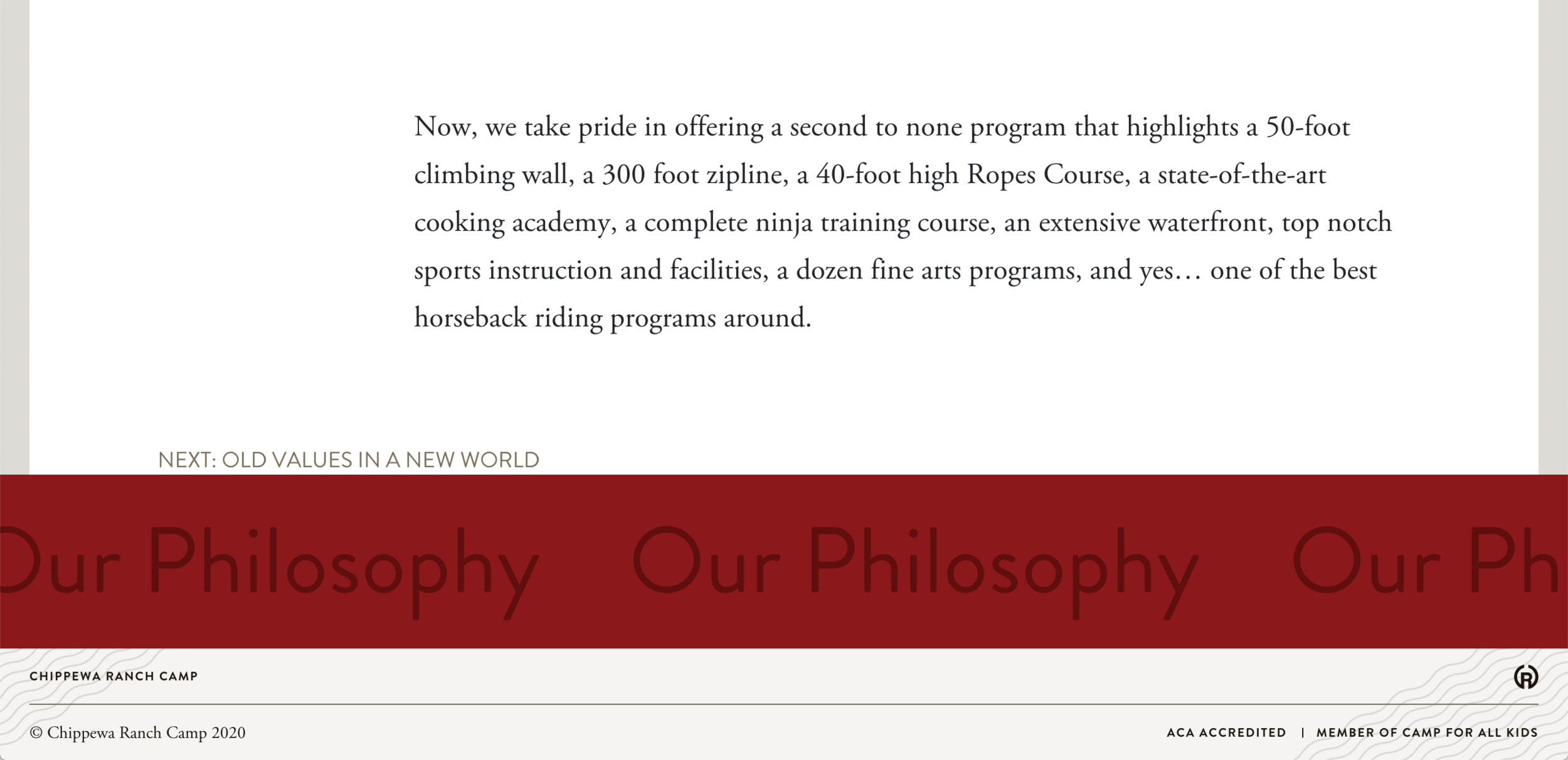
As the name suggests, Chippewa Ranch Camp began life as a riding camp and still maintains one of the best equestrian programs in the midwest. Their logo was based on a horse brand, combining their initials — C.R.C. — into a circular logomark. Unfortunately, the line weight of the encircling "Cs" didn't match the contained "R." In addition, a free-standing "R" doesn't fill a circle very well, leading to the addition of distracting serifs to compensate.
Early in the website redesign project, I sketched some ideas for a new logo that maintained the camp brand (in every sense of the word) while updating the logomark for modern usage.


Brand Identity
Logomark
In particular, joining the bottom ends of the two "Cs" with the legs of the "R" gave the mark a uniform appearance while ensuring it was easy to read on screen and at small sizes — even down to 16px square for the new website's favicon.
Variants
I ended up with more logo variants than I would have liked, but the camp produces a wide variety of t-shirts and other licensed apparel — on a yearly basis — and needed options that worked on top of different colors and in a wide range of applications. The reverse variant, with yellow and white on top of a dark background, is my favorite.
Colors & Type
While refining the logo, I selected print and screen versions of the camp’s primary red and gold colors with three earthy complements (black, tan, and brown). I also settled on Bauer Bodoni, Brandon Grotesque, and Adobe Garamond for their brand’s type. Once the logo, colors, and type had been approved, I wrote a simple, two-page brand guide — suitable for easy reference and distribution to vendors, t-shirt printers, and other third parties that will handle the camp’s brand.

Website Redesign
As we worked on the new logo and refined the colors palette, the client and I decided to move their brand away from the heavy textures and patterns that defined their old site. We moved, instead, towards something lighter and brighter — something elegant, but retaining a sense of whimsy and unpredictability to match Chippewa's fun-loving personality. During early planning for the site, I began researching grid-based, asymmetrical layouts.
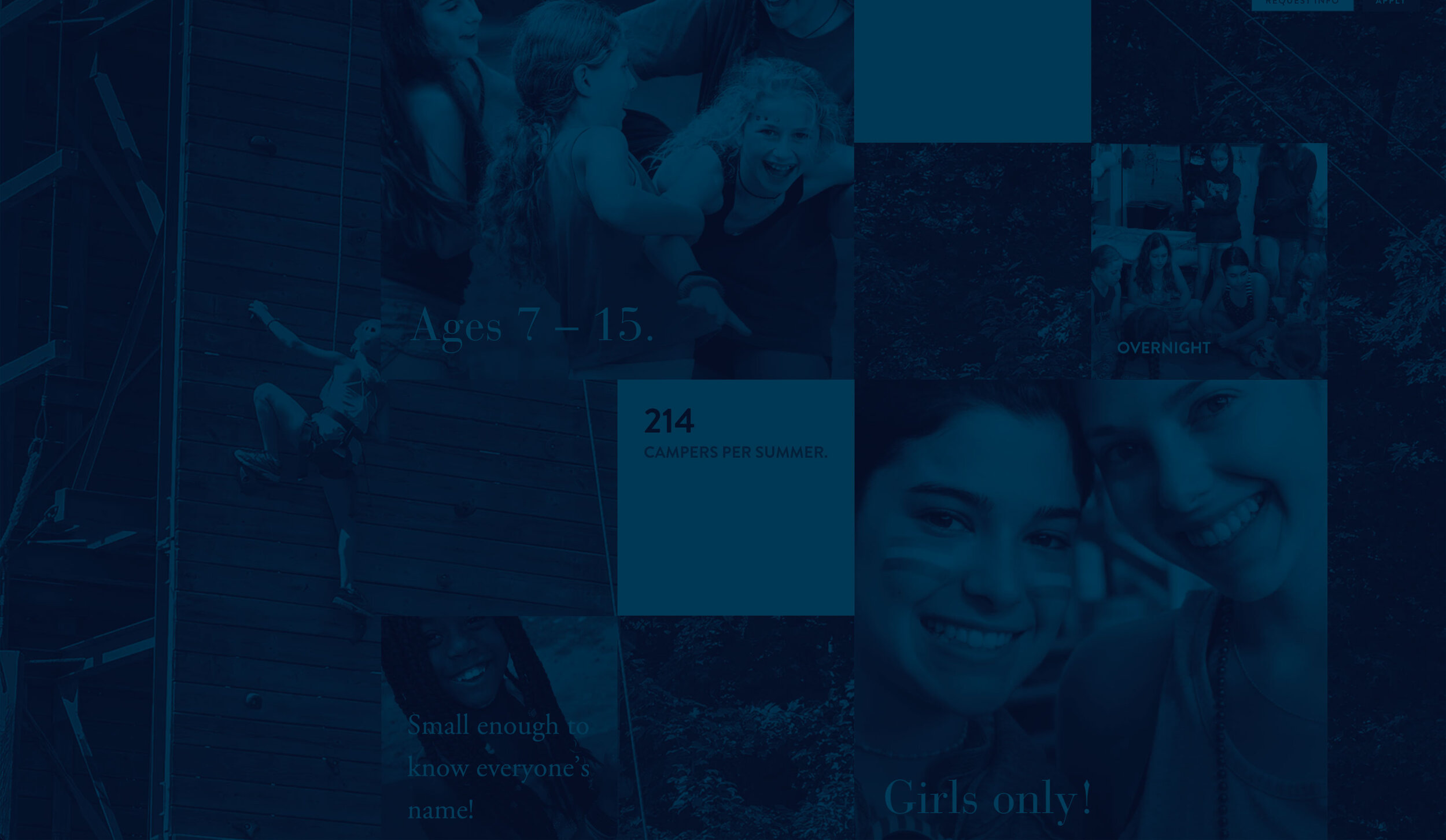
Chippewa's mission and values took prominence on the new home page, followed by a basic summary of the camp's location, program, and amenities. Next comes a countdown, ticking off the seconds until the summer. Believe it or not, many new and returning campers visit the site regularly just to see the days remaining (it's a camp thing).


I designed elements and pages at multiple breakpoints from the very beginning, giving the client a feel for how their new site would look on different devices and providing clear directions for the developers as they built a rapid
The primary navigation header remained fixed on scroll, keeping the fly-out menu available.
Number one favorite thing on this website — the big, red scrolling marquee next links. You just don't see things like that on the Internet much anymore. Take a look at it live!

Promotional Brochure
Following the completion of the website, it became clear an additional, complementary printed piece would be required to maintain the camp’s brand image and close the deal in their sales funnel. Soon after its launch, I began work on a large, catalog-style brochure.
Catalog Brochure
36 pages + cover
Perfect bound
7” x 10”
Photography
Throughout the website project and then the brochure, photography posed a significant challenge. Chippewa shot and provided a lot of work, but since it was taken by a wide variety of photographers, with widely varying levels of skill, I spent a significant amount of time reviewing the shots provided and selecting the right ones for tone, color consistency, lighting, and emotional impact.
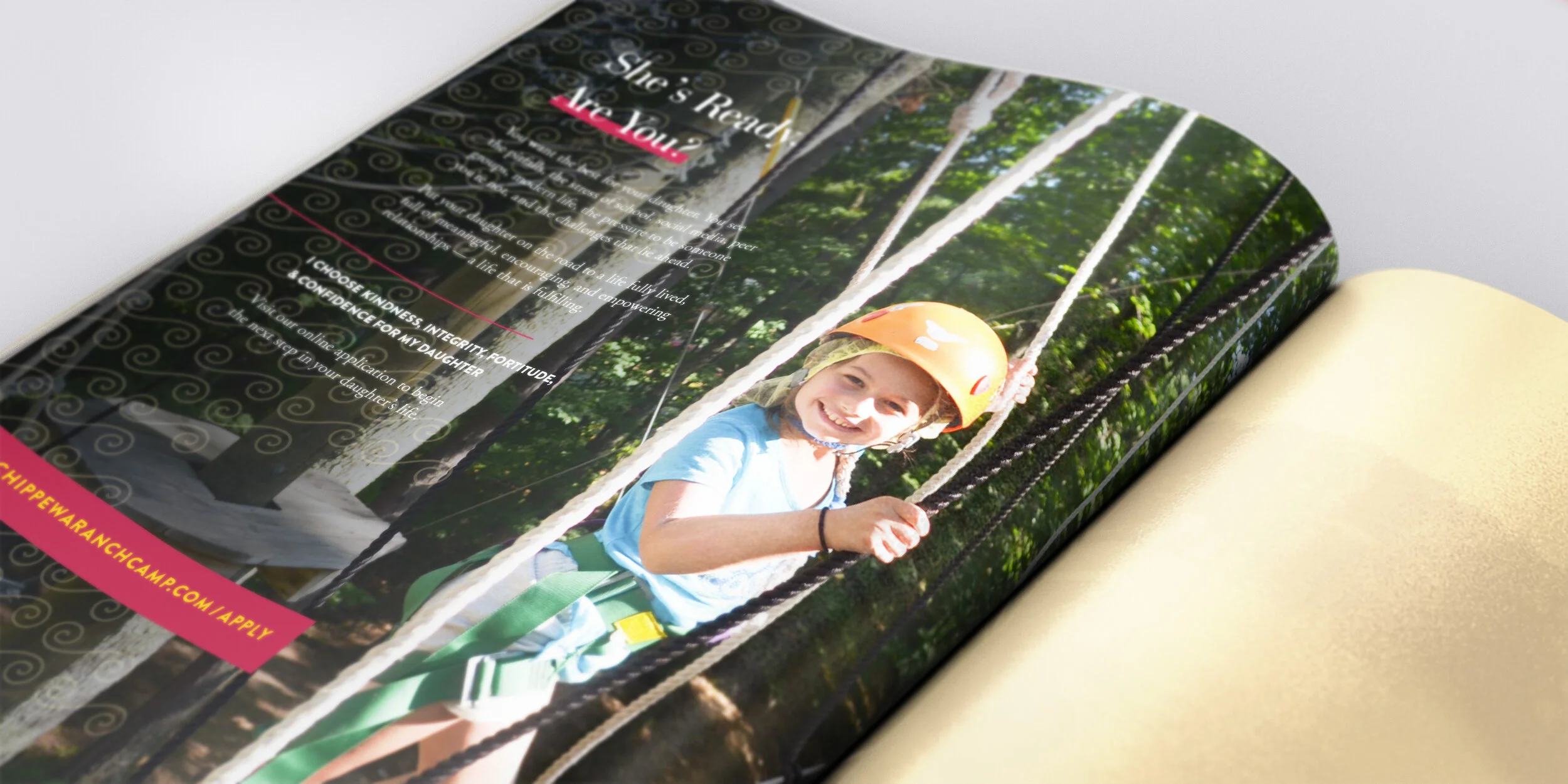


Kindness is Chippewa Ranch Camp’s leading value (True North, as they identify it on their compass of virtues) and it was important to keep it front and center on both the website and the brochure. A deep, sisterly regard for one another had to be clear in each photo, complemented by accessible navigation and clear, open layouts. The design couldn’t be too clean-cut, however — it needed to retain some spunk and spontaneity, reflecting the free-wheeling, fun-loving spirit of a summer at camp.